
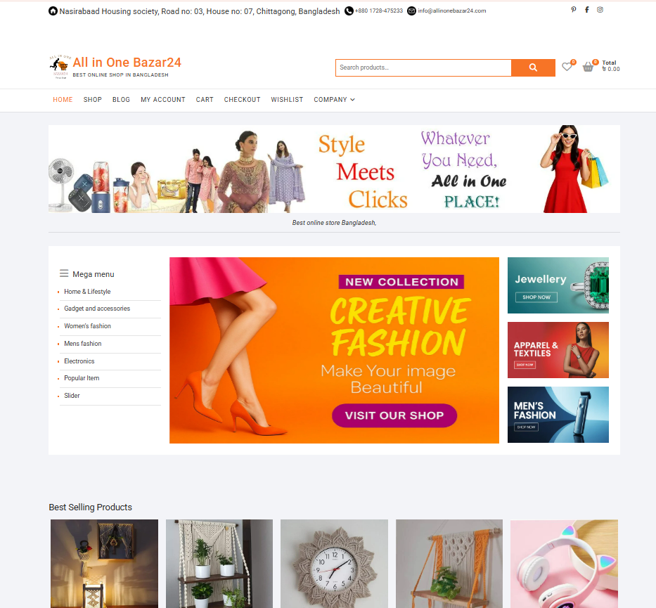
This shows a complete eCommerce website design and content architecture process carried out for All in One Bazar24, which is an online shop that deals with many consumer products. Our design agency emphasized a clean, scroll-friendly homepage that promotes product categories and featured & trending collections in an intuitive format that’s simple to find your way around.
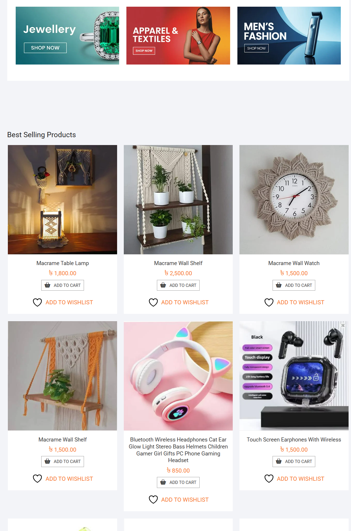
We improved product listings with images, pricing, ratings, CTA, etc. features to facilitate faster purchase decisions and enhance user engagement. Category position, product collection, and visual arrangements are carefully made for letting customers find their items without feeling overwhelmed. The outcome is a transaction-oriented online shopping experience that enhances the presentation of products, reinforces the credibility of your brand, and provides a more structured shopping process for users.
News & Media Website Management Case Study
Project Overview
I was working on a breaking news & media website that specializes in publishing real-time news in many categories such as astrology, sports, entertainment, and business, along with tech, lifestyle, and world news. The platform publishes throughout the day, so the focus has been on improving layout consistency, content flow, and the user experience.
Homepage Layout & Content Structure
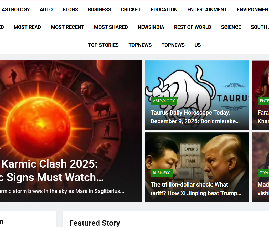
Top Stories are showcased on the homepage. A main splash with a strong headline and photograph in a featured position. Trending stories are displayed next to each other in a grid. Tag categories (Astrology, Entertainment, Breaking News, Top Stories) for fast category scanning. This design increases user engagement by allowing readers to easily find the top story in the category.
Top Story Hero Section
The website is very well organized in terms of category blocks. Displays related topics with a clean break. Provides easy navigation for readers’ search of certain news areas. Showcases the most-clicked news of the day with strong visuals. Comes with sports highlights and top stories. Uses thumbnail cards for a quick browse of images. This will increase the session duration and encourage visiting more pages.
Category Highlights
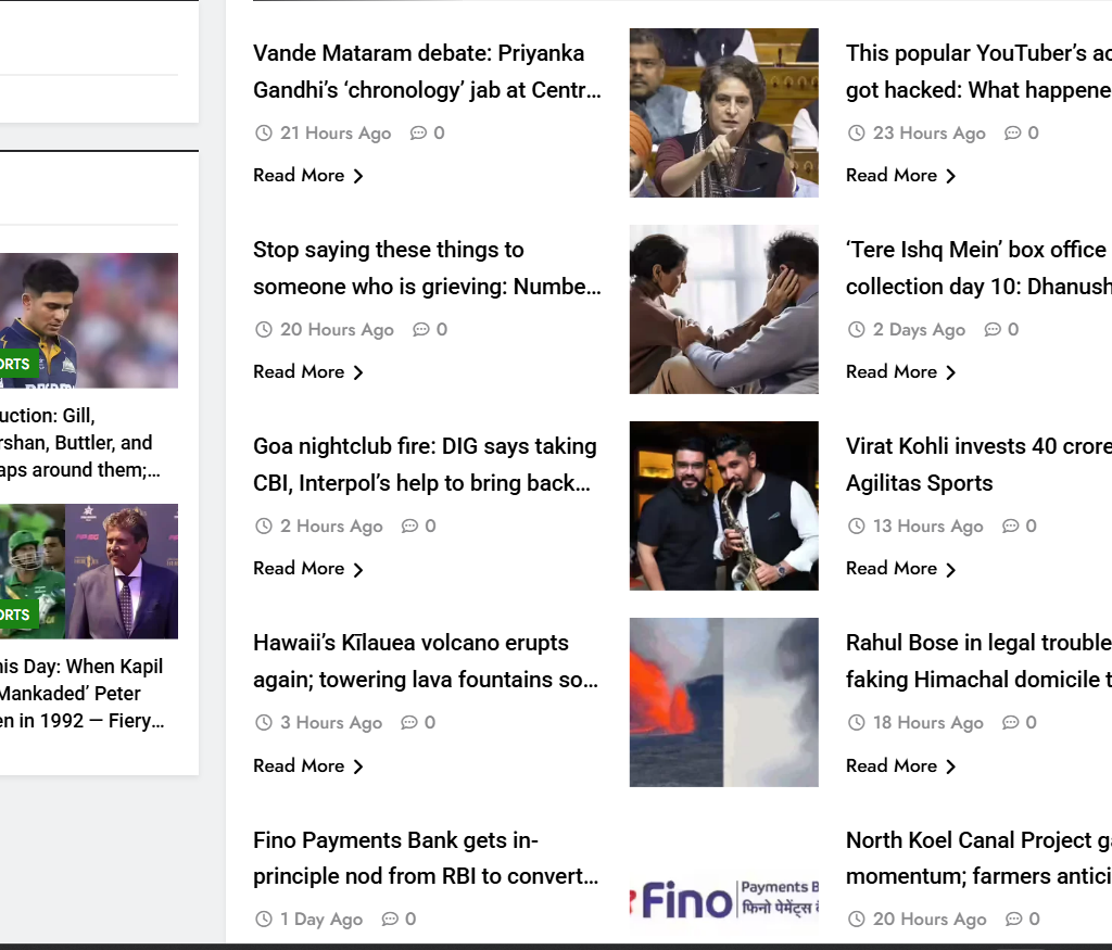
The right-side content feed features. Recently published articles with timestamps. Category labels for readability “Read More” CTA links to increase in click-throughs. A mishmash of news on politics, entertainment, tech, and the world with a bit of attitude. The design is optimized for easy and comfortable scrolling, allowing users to discover more stories.
Key Strengths of the Project
Clean and structured magazine-style homepage. Category and thumbnail use quite clickbait-worthy extents. Smooth browsing through multiple news categories. Great readability with white space and contemporary layout of elements. Designed for fresh content that is updated regularly.
If you want to make this kind of website, do contact us; we can make it for you.